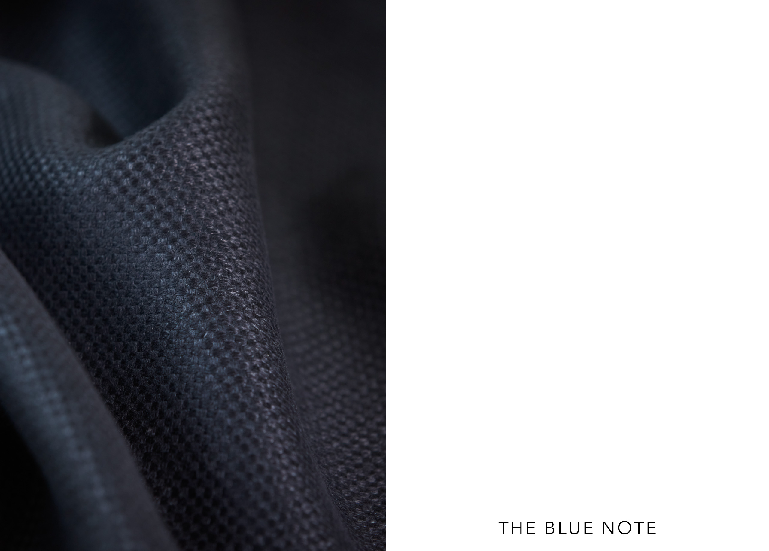
Blue
Contrary to popular belief, color plays a central role in the conception of Liaigre’s projects. Both subject and object, it sets the tone and contributes to the atmosphere that emerges from a space. The material libraries of the Studio and showrooms reflect the importance of color and the extensive variety of available ranges. At the heart of this palette, blue—explored in all its shades—features prominently in many creations. Like red or green, it carries symbolic significance rooted in the history of civilizations and cultures.
From relative indifference—or even mistrust—toward blue in Antiquity, it gradually gained widespread favor, becoming one of the most cherished colors from the Middle Ages through the modern era. This widespread appeal makes it a familiar and reassuring tone within the domestic space. Soothing and dreamlike, blue is always good company.
Photos : Julia Hetta, Claire Israel, Sophie Carre, Mark Seelen, Benoit Auguste | Texte : Françoise-Claire Prodhon
See details
Contrary to popular belief, color plays a central role in the conception of Liaigre’s projects. Both subject and object, it sets the tone and contributes to the atmosphere that emerges from a space. The material libraries of the Studio and showrooms reflect the importance of color and the extensive variety of available ranges. At the heart of this palette, blue—explored in all its shades—features prominently in many creations. Like red or green, it carries symbolic significance rooted in the history of civilizations and cultures.
From relative indifference—or even mistrust—toward blue in Antiquity, it gradually gained widespread favor, becoming one of the most cherished colors from the Middle Ages through the modern era. This widespread appeal makes it a familiar and reassuring tone within the domestic space. Soothing and dreamlike, blue is always good company.
Photos: Julia Hetta, Claire Israel, Sophie Carre, Mark Seelen, Benoit Auguste | Text: Françoise-Claire Prodhon
Close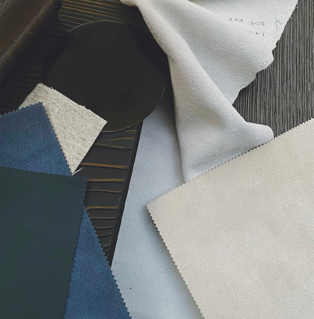
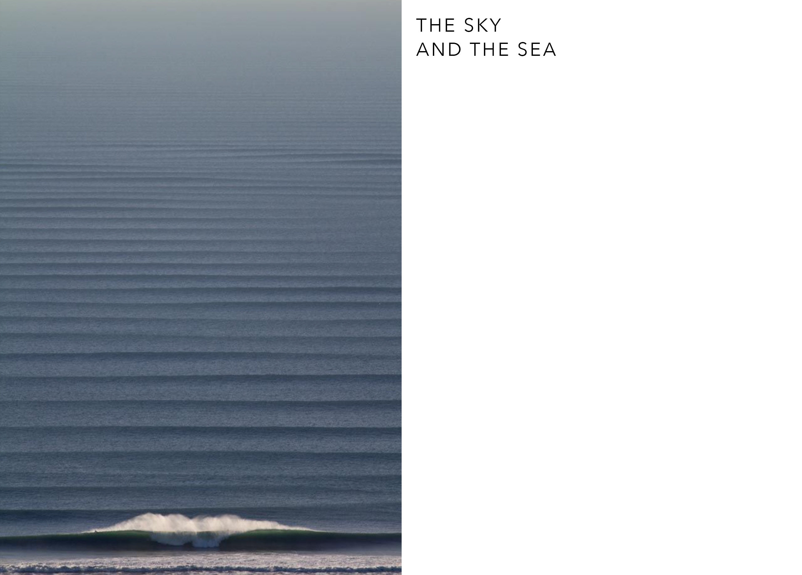
Simply uttering the word “blue” instantly evokes images of the sky and the ocean. Yet this color hasn’t always been associated with the sky and water. In Byzantine mosaics and religious painting from the Middle Ages to the early Renaissance, skies in scenes depicting God, Christ, or the Virgin were more often rendered with gold backgrounds, symbolizing the divine realm. As for water, it was associated with green until the 18th century. The shift came with geographers, who needed to clearly distinguish forests and seas on maps: forests remained green, while the oceans definitively turned blue. Our current perception of blue is relatively recent. Today, it seems inherently linked to our environment and to our planet—dubbed the “blue
planet” since we’ve begun observing it from space. Blue invites us to travel and contemplate. It offers the immediate comfort of stepping back from reality. The vast, unfathomable expanses of sea and sky foster daydreaming. This tendency to inspire waking dreams is surely one reason blue is perceived as a calming color. But this perception stems from a romantic vision of blue, which, in 19th-century poetry and literature (Novalis, Goethe), came to represent a certain sentimentality—sometimes veering into nostalgia or melancholy. From the poet’s innocent blue flower to the blues sung by jazz musicians, the connection is seamless.
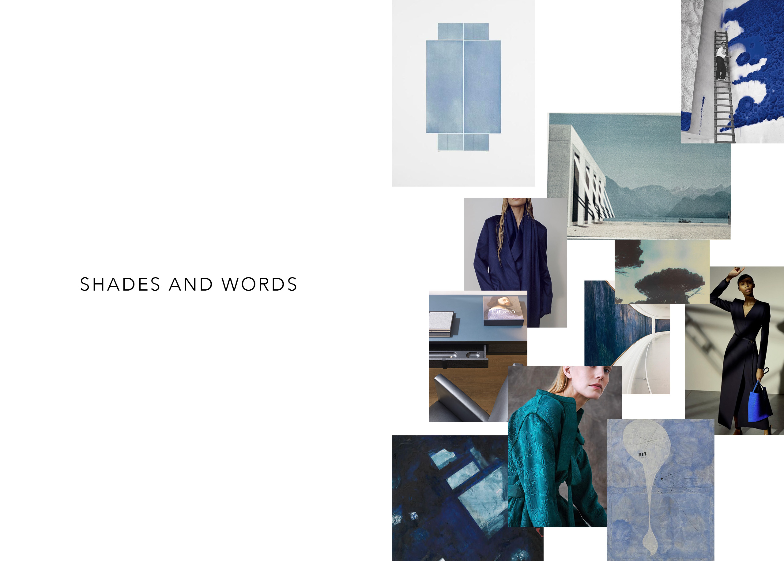
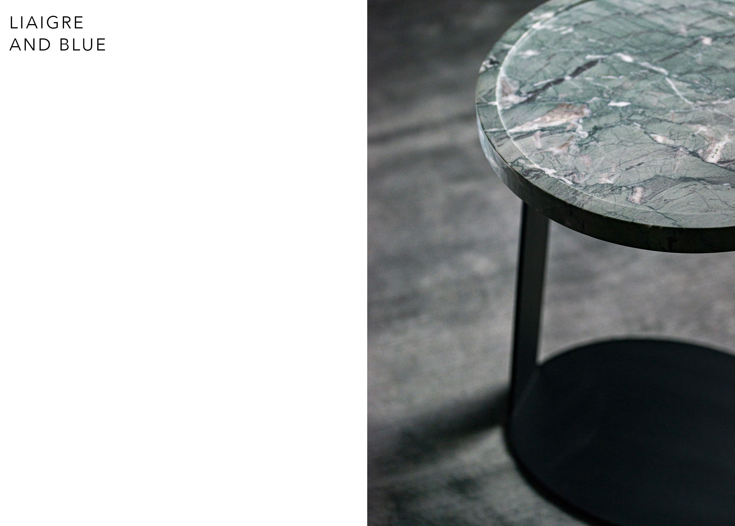
Nature offers a vast array of shades—from deep navy verging on black or violet to the palest tones, vivid electrics, petrol blues and teals, green-leaning turquoises, icy blues, soft pastels, blue-greens, near-mauves, and near-grays. The vocabulary used to describe and catalog these shades is intimately tied to the history of pigments and dyes—and therefore to the history of art and the decorative arts. Rarely mentioned in Greco-Roman Antiquity, blue was considered unimportant, even disliked. It was difficult to master as a dye, so people didn’t wear it. It wasn’t until the Middle Ages that blue began to gain prominence in European society—through heraldry (and later national flags), becoming a royal color, equal to and rivaling red. During the
Protestant Reformation of the 16th century, a moral distinction arose between “modest” colors and more ostentatious ones. Blue, alongside black, brown, gray, and white, was considered “acceptable” and benefited greatly from this perspective. This moral view of color heavily influenced dress codes—a legacy still visible today in men’s fashion, workwear, uniforms, and formal attire. The 18th-century invention of many blue shades by dyers—such as Prussian or Berlin blue—enriched the darker palette and helped cement blue’s status as a favorite. Simultaneously, blue ceased to be seen as a warm color; now deemed cool, it became associated with calm and serenity.
Blue has established a lasting presence in the everyday lives of Western cultures—across clothing and interior design, it remains a favorite color for many. One immediately thinks of denim, worn across generations, but also of blue’s many shades that appear—alone or combined with others—in countless interiors. Easy to live with, blue seems to bring near-universal agreement.
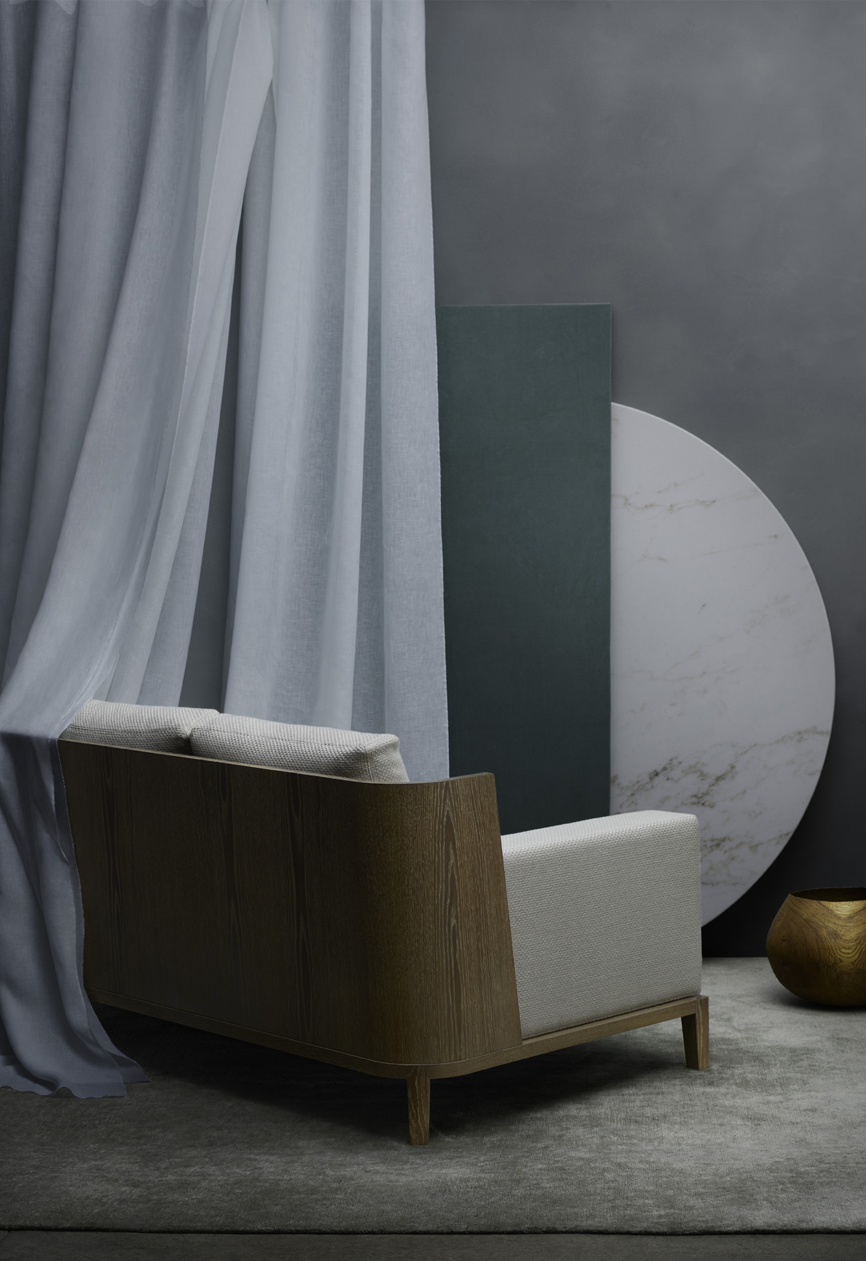
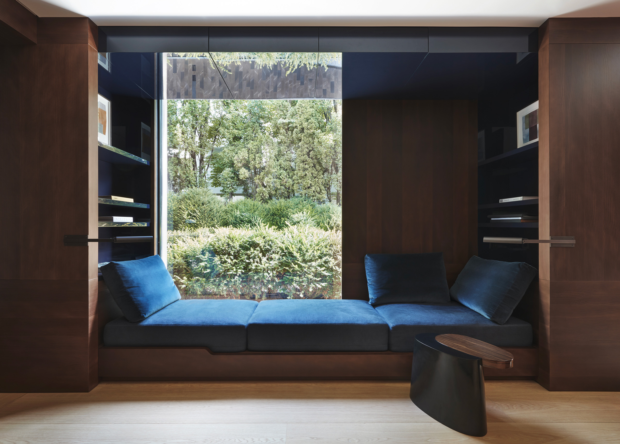
At Liaigre, blue is a frequent guest across various projects, whether for a city apartment, a townhouse, a mountain chalet, a coastal retreat, or a yacht. The Studio uses it with subtlety—applied like a brushstroke, an accent, or punctuation mark. It becomes a design language element that blends harmoniously with others, as its hues converse easily with various woods and stones. “I like the precision of a color that emerges from the shadows, which I always use in bold strokes,” said Christian Liaigre. This insight applies particularly well to blue, which pairs beautifully with deep tones—black, brown, or gray. A deep blue echoing the richness of a dark wood creates an enveloping, warm atmosphere. This dark and nuanced palette evokes Christian Liaigre’s fascination with Japanese culture and its approach to color—especially in decorative arts and fashion, where black and midnight blue are often seen side by side.
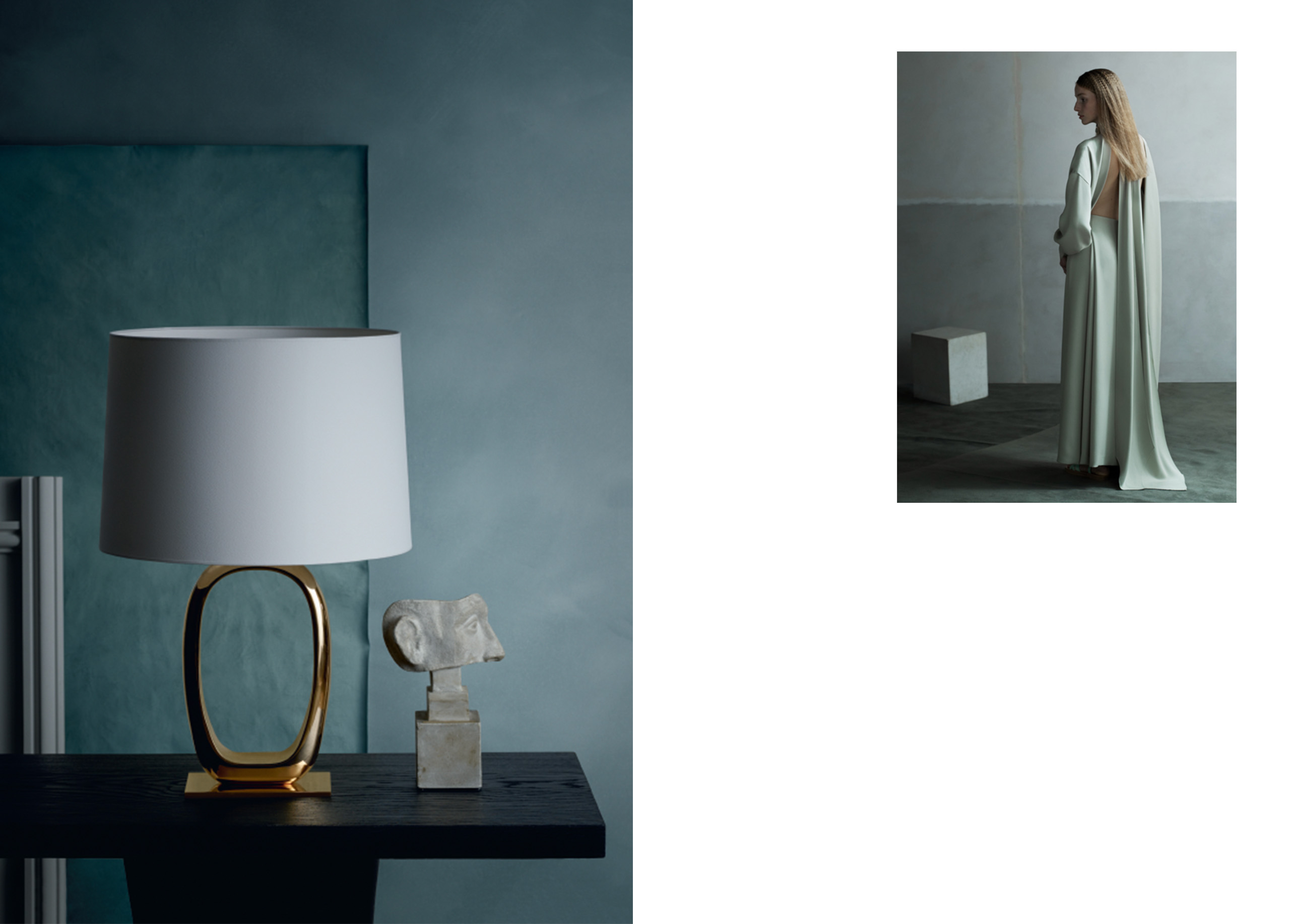
A vivid or soft blue contrasting with light wood brings a fresh, gentle note. Lighter blues echo the aesthetics of 18th-century French decorative arts, when the Sèvres Manufacture developed its famous shades—especially “celestial blue,” a near-turquoise. These soft tones were also in vogue during the modernist period—for instance, the pale lavender blue chosen by couturier Jeanne Lanvin for her bedroom, designed by Albert Rateau and now exhibited at the Musée des Arts Décoratifs in Paris. Both the 18th century and the 1920s are integral to Liaigre’s creative heritage and imagination.
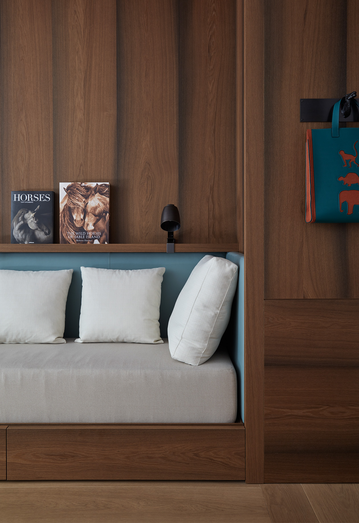
Leather, lacquer, fabric, rugs, accessories—the Liaigre Studio welcomes blue into every room of the home: midnight blue velvet adorning a sofa, turquoise rugs, petrol blue leather in a dining room, lavender leather on a banquette, a reading nook draped in blue, a yacht cabin, a screening room… Depending on its intensity and depth—or conversely, its lightness—blue vibrates in different ways: it can evoke a nocturnal or diurnal ambiance, introduce mystery, and consistently evoke a sense of comfort and calm. Familiar and unsurprising, blue naturally finds its place in our interiors—its authenticity and simplicity continue to charm.
Discover other
“Liaigre: 12 Projects” – reflections on a reissue