A eulogy to black and white
A short time ago, we approached Liaigre’s particular aesthetics from a color spectrum angle … The two «limits» of black and white hold a specific place at the heart of this color palette. At Liaigre, there is a style of black and white or some black and some white, as these two colors are not systematically presented together…
See detailsA short time ago, we approached Liaigre’s particular aesthetics from a color spectrum angle … The two «limits» of black and white hold a specific place at the heart of this color palette. At Liaigre, there is a style of black and white or some black and some white, as these two colors are not systematically presented together…What do we mean exactly? To quickly answer, we could evoke an artistic ideal, a reflection about lines, a decorative division that focuses on what is essential. There is something clear in the choice, an assumed desire for moderation, the theory of elegance cultivating a concept of shapes. The refinement of this style is paradoxically the place for creative freedom expressed through a subtle sense of nuance. Black and white are two absolute colors that are as sensitive as they are radical: they are excellent for expressing light, darkness, shine or mattness. To do this, the nuances that mostly affect the perception of light refer to a choice of materials that can vary its impact. Here again, the diversity of materials and finishes developed by the Liaigre studio make all the difference
Close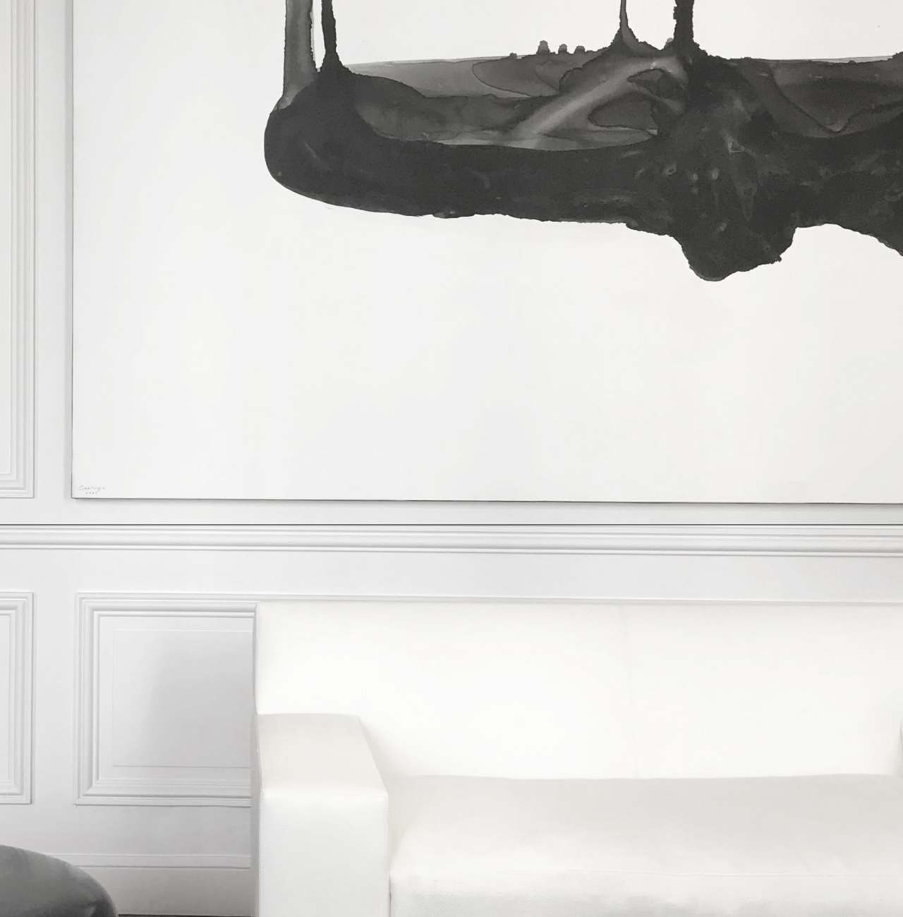
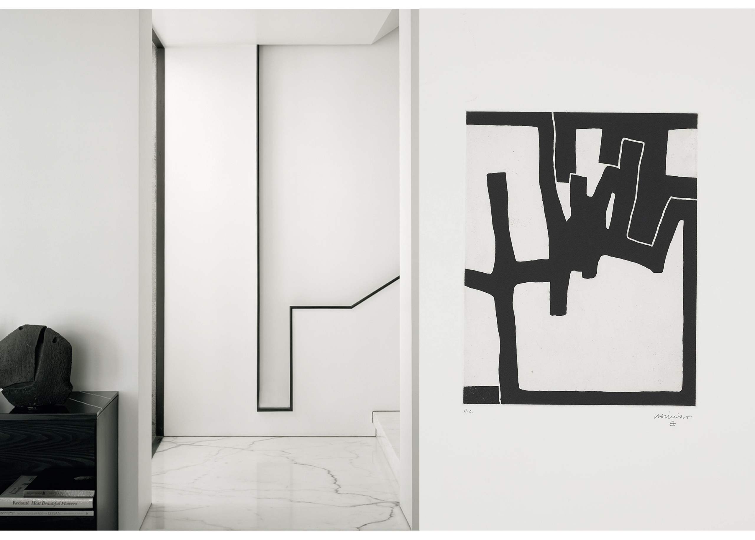
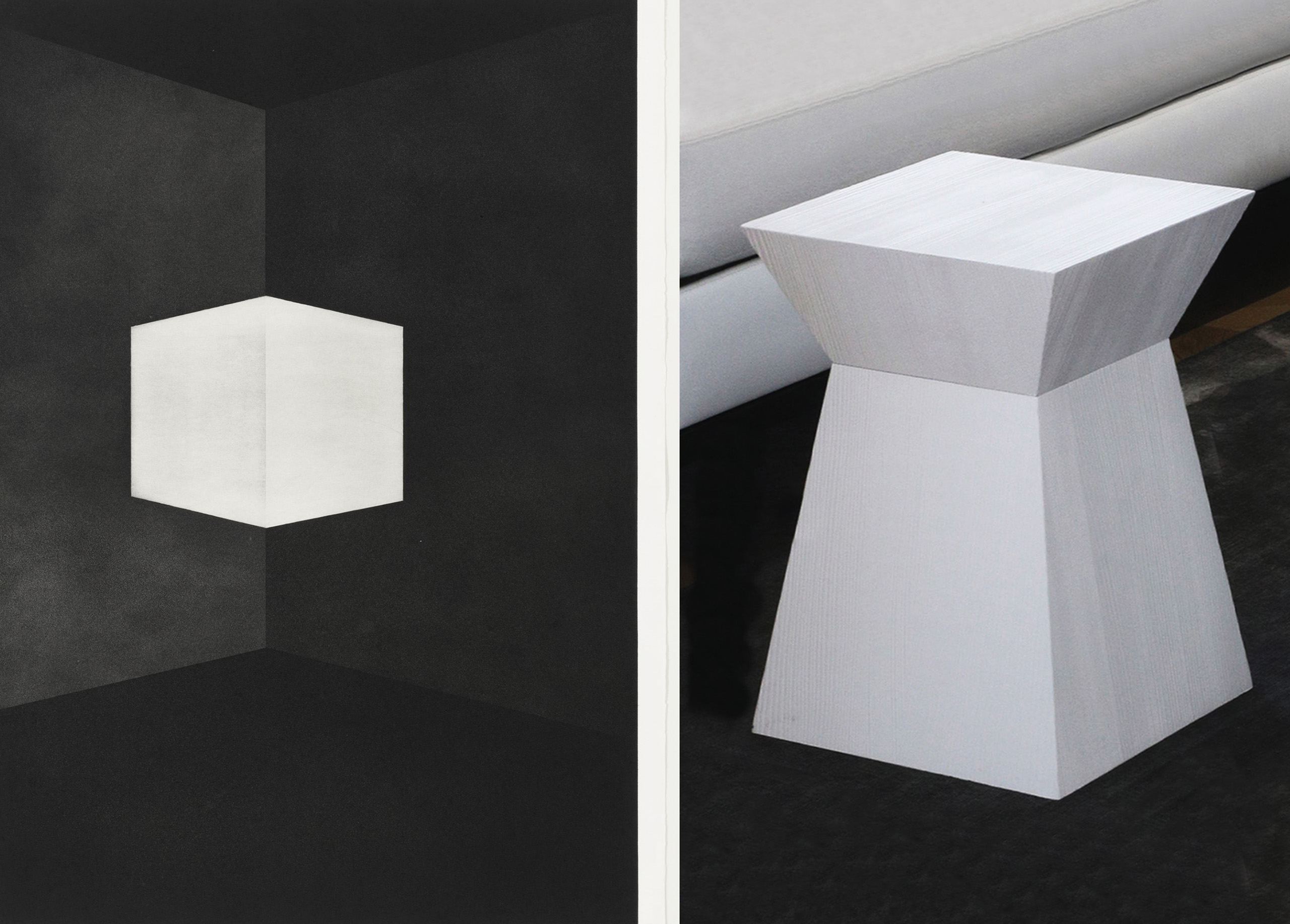
The art of lines When we combine black with white, one of the first images that comes to mind is that of the relationship between ink and paper, whether it be handwritten texts or the art of calligraphy… Black and white also refer to drawing (lead, charcoal, black stone, Indian ink) and the way in which lines are expressed through a sequence of different nuances, or in contrast to the way in which they appear straight, synthetic and simple on paper. This second option marks the emergence of modernity: Henri Matisse whose lines does not overwhelm any detail; or Ellsworth Kelly, who when drawing plant motifs in large paper formats, is inspired by Matisse’s simple lines which excel in expressing life by their great simplicity. Economy in drawing translates a quest for authentic elegance. This ideal in the history of furniture is that of the late eighteenth century in France
which was the so- called “Louis XVI “style, popular with the cabinet makers Jacob and Riesner, who favored simple lines. It is also the approach of some great decorators of the 1920s, who, following the example of Ruhlmann, move towards the same precision of lines. At Liaigre clean lines are constant… Not one piece of furniture or lighting escapes the approach of clean, efficient lines which are reduced to carefully define the shape as closely as possible, so that each creation presents itself in a very «graphic» way in the specific context of a decor, whatever it be… There is nothing like black or white to bring out the best of this style. With demanding radicality, Liaigre designs interiors with an identity based on this bias by using powerful black or white on a major scale, or creating a game with dual tones and contrasts between these two opposites that are united by the same story.
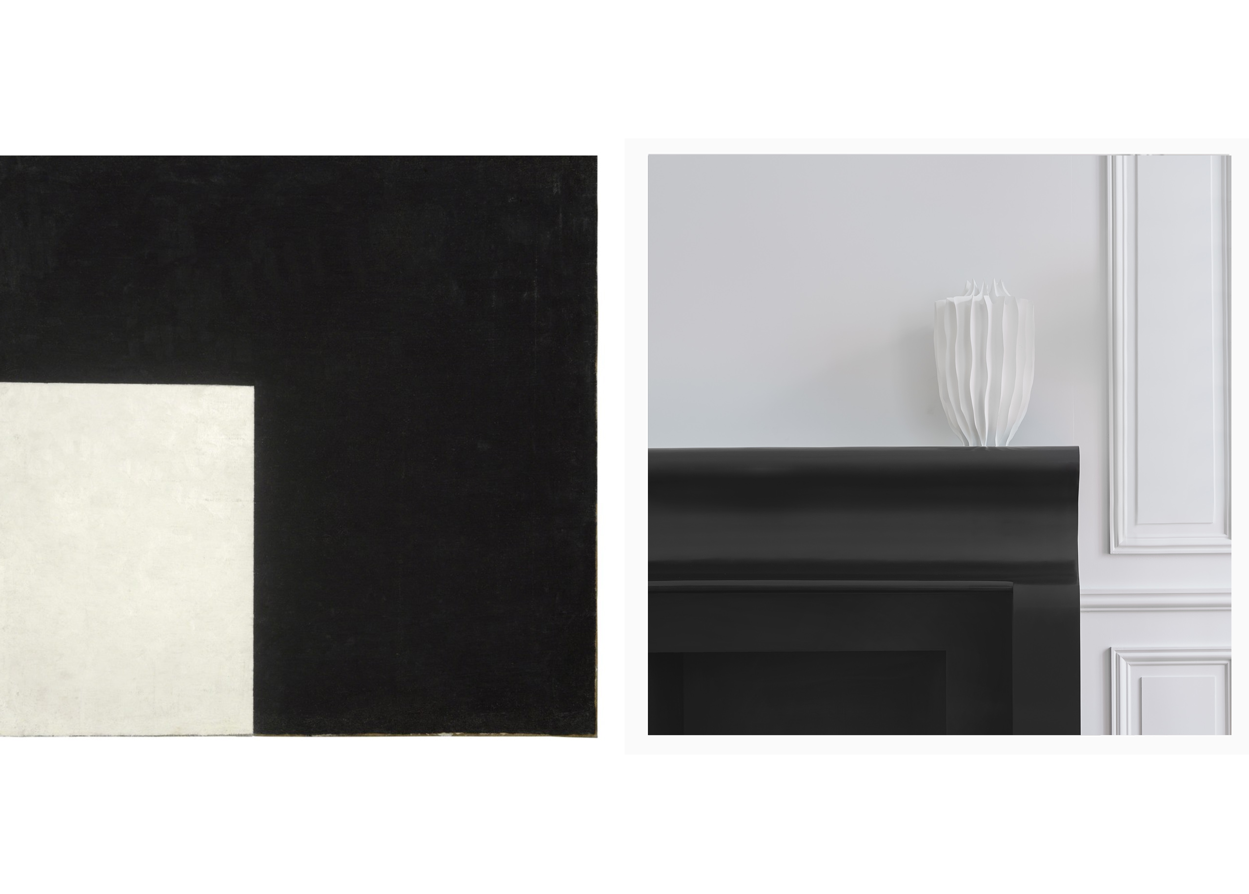
Shadows and lightLet’s talk about history… since when we speak of color, we’re speaking about culture… Each culture has its own color chart, symbolic meaning, perspective and codes, fads or rejections. For centuries, the West didn’t consider black and white as colors but «achromatic» tones! Tones that give substance to the notion of nothingness or emptiness, but also expressing light or darkness, transparency or opacity… The twentieth century will change the situation, by modifying this binary perception of black and white, thanks to an awareness of other cultures and civilizations (mainly those of Japan, China of the Orient in the broad sense). From opposites, the two colors become complementary to the image of yin and yang – inseparable. The avant-garde of the beginning of the century and notably Kasimir Malévitch
with his abstract paintings of 1915: The Black Cross, The Black Square (a black square on a white background), White on White ( a white square on a white background), contribute by establishing a chromatic stye in 20th Century art.. Other artists will come: Robert Ryman whose work will focus on white, but also Pierre Soulages whose concept of outrenoir (beyond black) will demonstrate the latter’s abilities to generate its own light and express other tones (red, blue, purple). In Liaigre’s aesthetic vocabulary, black and white are available in a wide range of modulations playing on light, mattness or opacity. The subtlety of the style comes from a reflection on subjects and what they generate in terms of perception and feeling.
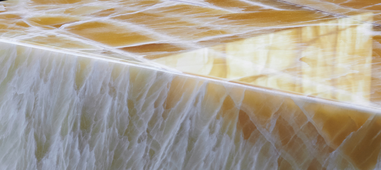
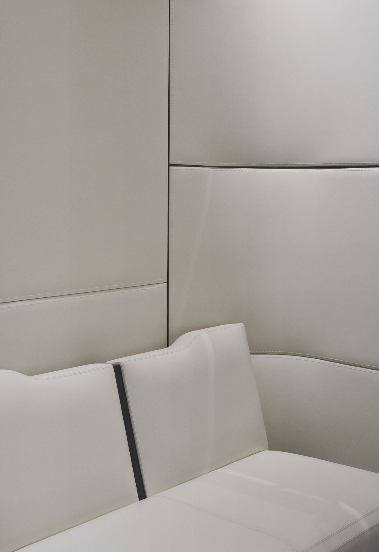
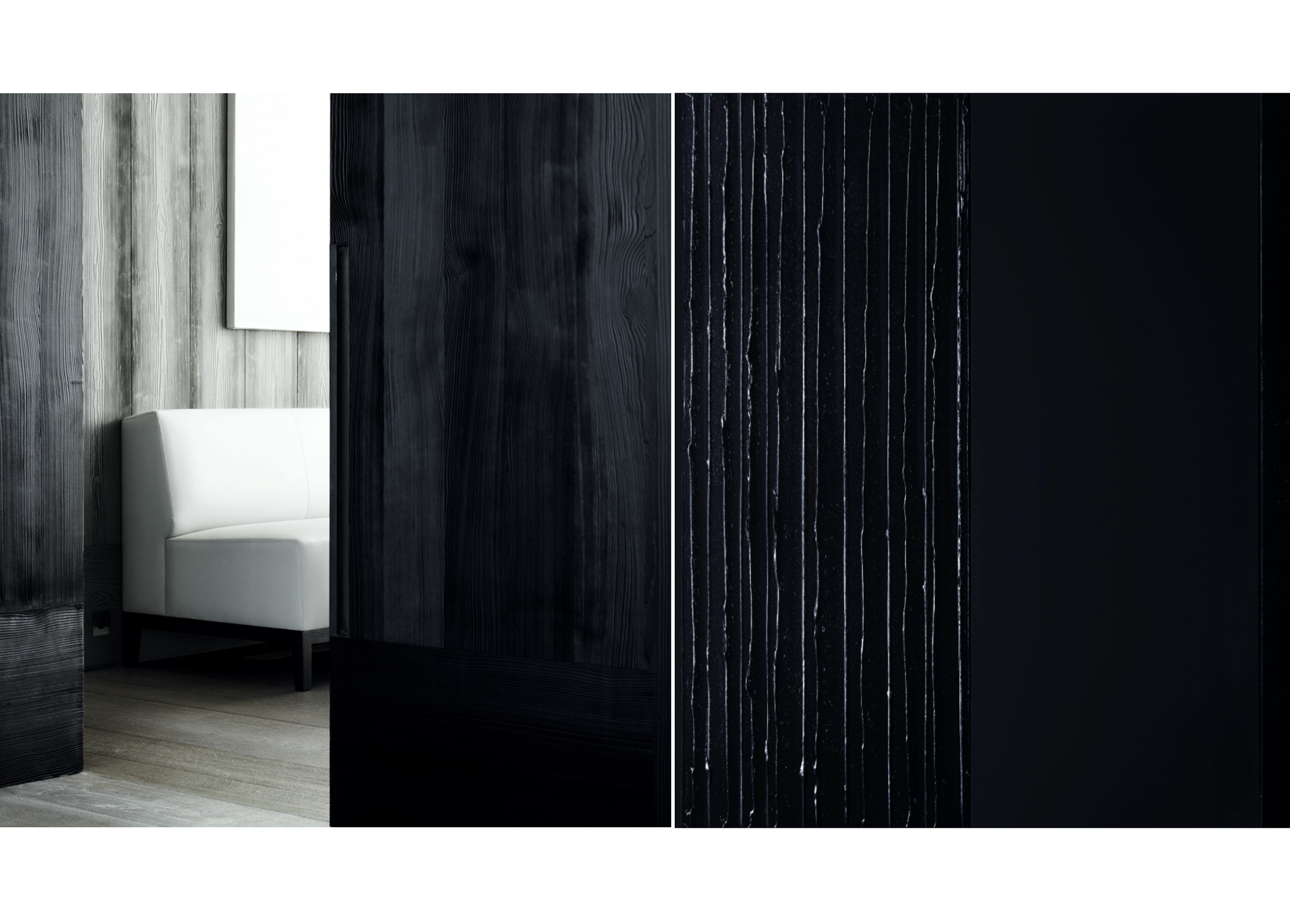
Effects of materials - Liaigre’s style has always been associated with a wide range of materials and finishes that can offer a wide variety of choices. These same materials and finishes allow for a large number of shades, which are particularly fine and subtle when it comes to colors as radical as white or black. We could speak more precisely of ranges of white and black not nuanced by a slight hint of another color (as we generally understand it) but by a texture, a materiality. Thus, a lacquer that is black, smooth, shiny or profound, reflects its environment and lets the light in throughout the day, changing the intensity of the black according to natural or electric lighting… Black or white bronze with a patina finish, depending on whether it is smooth or textured, will hold light differently, not to mention smooth or textured leather, darkened or wire brushed wood! The reflection on materials softens the precision of lines. Where the expression of a very reserved design could have been rather dry and minimalist, a sensitive relationship with materials gives clean lines all their poetry...
Robert Ryman, Classico 5, 1968 / White leather seating.
Robert Ryman, Classico 5, 1968 / White leather seating.
Effects of materials - Liaigre’s style has always been associated with a wide range of materials and finishes that can offer a wide variety of choices. These same materials and finishes allow for a large number of shades, which are particularly fine and subtle when it comes to colors as radical as white or black. We could speak more precisely of ranges of white and black not nuanced by a slight hint of another color (as we generally understand it) but by a texture, a materiality. Thus, a lacquer that is black, smooth, shiny or profound, reflects its environment and lets the light in throughout the day, changing the intensity of the black according to natural or electric lighting… Black or white bronze with a patina finish, depending on whether it is smooth or textured, will hold light differently, not to mention smooth or textured leather, darkened or wire brushed wood! The reflection on materials softens the precision of lines. Where the expression of a very reserved design could have been rather dry and minimalist, a sensitive relationship with materials gives clean lines all their poetry...
Discover other
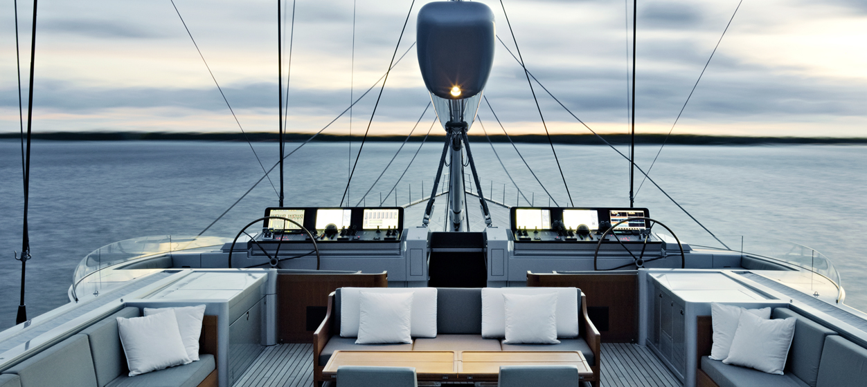
Yacht Design, an exercise in style